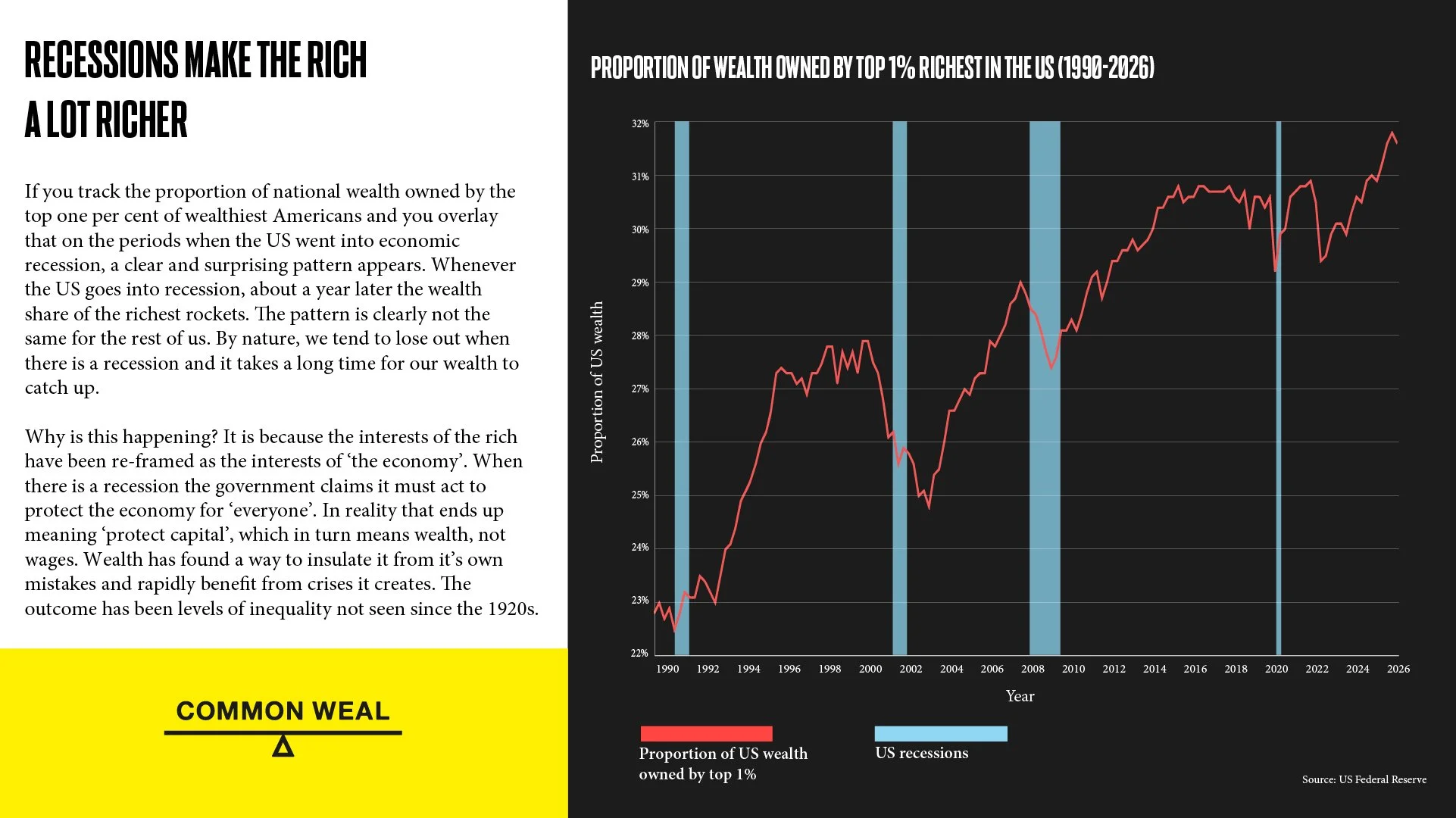
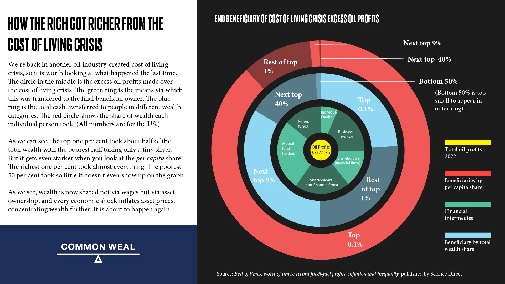
Graph showing the proportion of wealth taken by the very rich and when (and by inference how) they took it

Graph showing the surpluses and deficits in Scottish local government, before and after a land tax
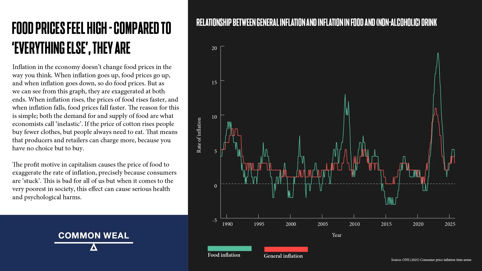
Graph showing how rises and falls in food prices significantly overshoot general inflation
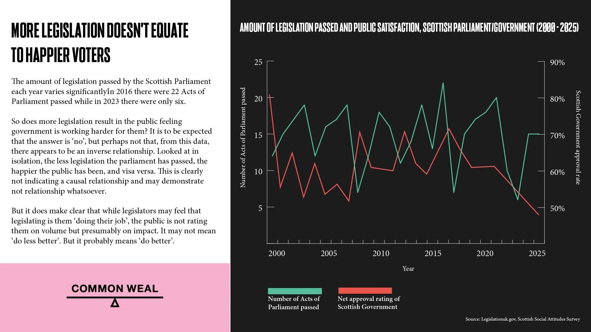
Graph showing the relationship between the amount of legislation passed in Holyrood and public satisfaction of government
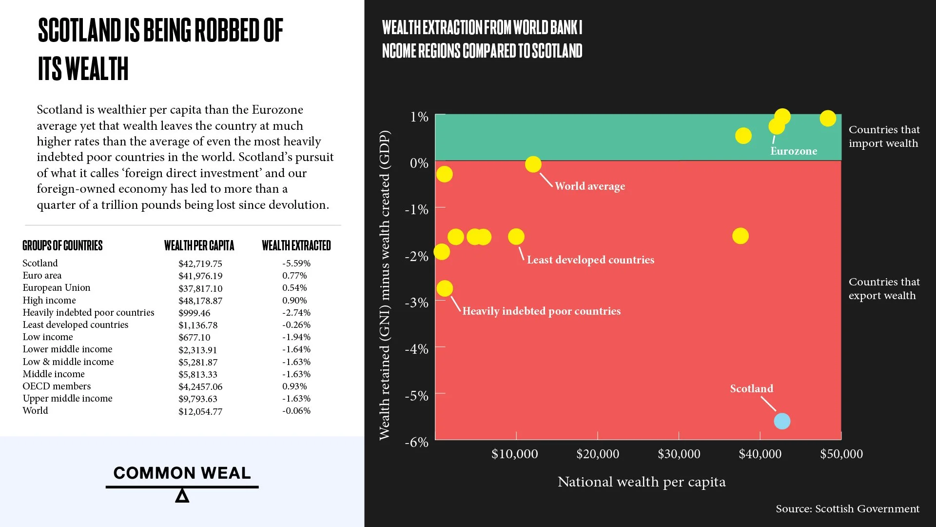
Scatter graph showing that Scotland loses its national wealth at a rate that simply isn’t reflected in any other comparable group of nations.