


Line graph showing the gap between numbers unemployed and the number of available vacancies

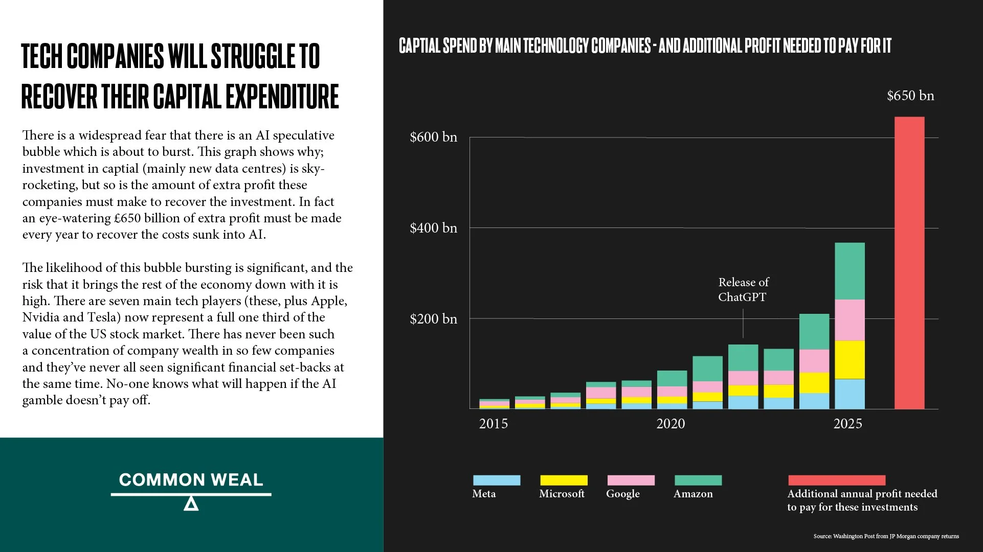
Bar chart showing the enormous extra profits the tech industry need to make to get their AI gamble to pay off
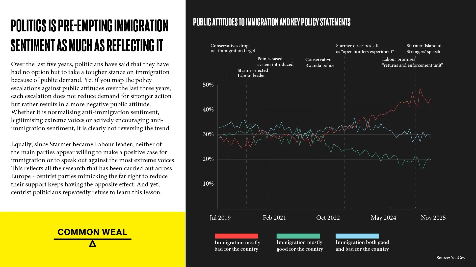
Line graph showing development of attitudes to immigration in the UK over the last five years.

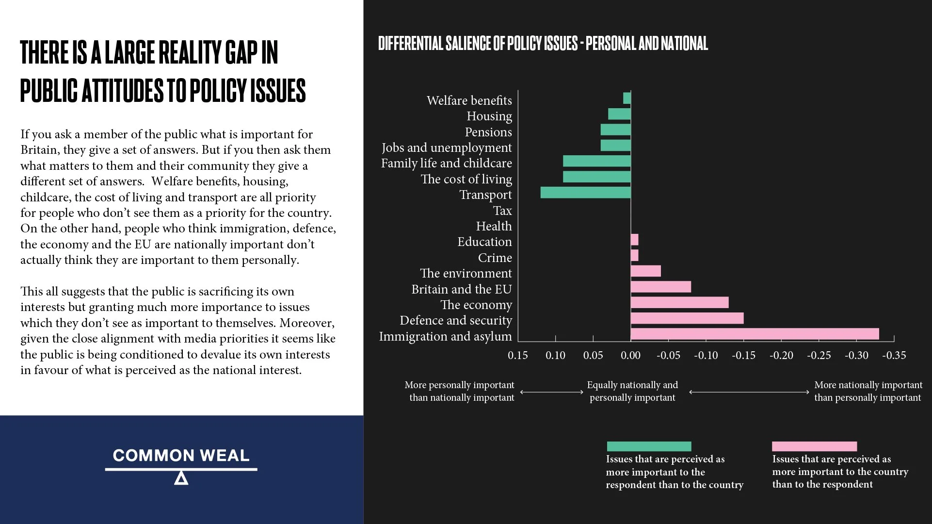
Bar graph showing the gap between what people think matters to then and what they believe matters to the nation


Bar graph showing that four out of five households in Scotland have been cutting back on spending to cope with the pressures of household finance.

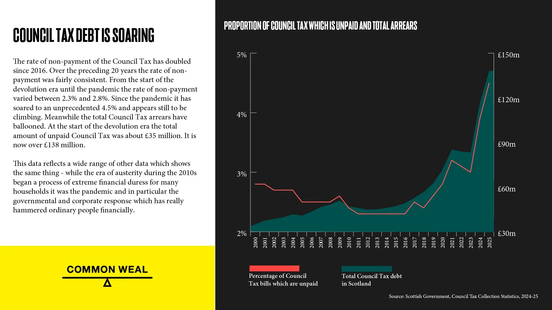
Graph showing that there has been an unprecedented ballooning of Council Tax debt in Scotland

Graph showing that only a small and decreasing proportion of Scotland’s new-build houses are affordable


Line graph showing that the rich got rich from public policy and public subsidy more than their own actions.

Line graph showing that it is financial speculation by banks which drives house prices, not supply


Scatter graph showing that Scotland loses its national wealth at a rate that simply isn’t reflected in any other comparable group of nations.

Graph showing that Scotland’s progress in reducing greenhouse gasses has basically ground to a halt.

Bar chart showing the relative costs and effectiveness of various methods of removing carbon from the atmosphere